

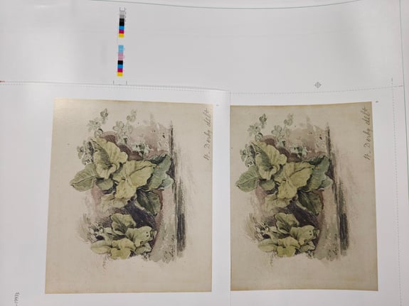
Colour is not decoration - it is intention.
Why you need a colour‑correcting photographer for CMYK print
In the world of fine art and contemporary galleries, colour is not decoration. It is intention. It is narrative. It is the artist’s voice. When a gallery commissions photography for catalogues, exhibition guides, press releases, or limited‑edition prints, the expectation is simple: the reproduction must honour the original work.
Every brand, every company, every project needs correct colour representation in the work they print. With significant investment into photography and print, whether you're a gallery owner or responsible for ensuring your business is presented accurately, getting this aspect of production right is imperative.
A colour‑correcting photographer isn’t just a “nice to have” - they’re the quiet hero behind every print which looks exactly the way you imagined it. When your final output is CMYK print, colour accuracy becomes even more critical, because what you see on a screen and what comes out of a press live in two very different worlds.
But achieving that level of fidelity is anything but simple; especially when the final output is CMYK print. This is where a colour‑correcting photographer becomes indispensable.
Why colour correction matters before you print
Fine and contemporary art photography is an investment and with the end result usually ending up as part of printed materials to support the latest exhibition, the representation of these images needs careful handling. With the treatment of photography for a range of sectors also being treated in the same way,
Healeys advise colour correction regularly, particularly when working with luxury property developments, high end fashion brands, luxury brands to produce brochures, catalogues and look books.
A colour‑correcting photographer adjusts hues, saturation, and contrast so the printed version stays as close as possible to the original image. Checking on screen is the way most approve or proof images but many colours you see on a screen simply cannot be reproduced in CMYK.

Why you need a photographer who understands colour management
Faithful reproduction protects the intent
Artists choose pigments, materials, and lighting interactions with precision. A photographer trained in colour correction ensures those decisions survive the translation from artwork to print. The same can be said for property and luxury brands where the depth of colour and accurate reproduction must represent itself faithfully to a potential buyer.
Collectors and customers expect accuracy
A catalogue, brochure or exhibition book is often the first encounter. If the colours are not presented accurately, the perception of the artwork or the product - and its value - is compromised.
Just imagine those famous reds we know so well such as Cartier Red, Ferrari's 'Rossa Corsa' or Coca Cola's 'Coke Red' appearing inconsistently because product and brand photography was not correctly colour matched. For every place colour matters, the photography does too.
Curators rely on accurate documentation
Curatorial notes, exhibition archives, and institutional records depend on accurate colour. Poor reproduction can distort historical documentation. For any sector and their brand guardians, the consistent record of their products is paramount, especially when represented over time.
CMYK soft‑proofing prevents surprises
A colour‑correcting photographer uses CMYK soft‑proofing to preview how the artwork will print, adjusting contrast, important details such as shadows, highlights. This level of proofing will also reveal shifts in colour accuracy linked to paper choices.
Digital colour vs. printed colour: two different languages
Cameras capture images in RGB, your screen displays in RGB, and your editing software may work in RGB.
But your printer? It speaks CMYK.
RGB (Red, Green, Blue) is a light‑based colour system capable of producing millions of vibrant, luminous tones. Without the proper translation to CMYK (Cyan, Magenta, Yellow, Black), RGB colours can appear muted. CMYK is ink‑based and different colour range.
Without the proper colour correction, this could mean neon colours disappear, deep blues can change, richer reds may flatten and shadows lose detail.


Expert colour support at Healeys
Trusted by many of the best fine and contemporary art galleries, alongside traditional print, Healeys can support every aspect your creative process with our in‑house design and artwork team.
Healeys offer colour correction both in‑house and on location at your gallery or studio, allowing us to review the original artwork on site and make adjustments in real time. This ensures complete accuracy and gives your client confidence in the final finish.
Our experienced photographer can make adjustments for colour correction, ensuring your imagery is perfectly matched to the final print output.
Put Healeys to the test
To help you see the difference colour correction makes, Healeys are offering any new clients complimentary scatter wet proofs. Compare colour accuracy with a 'before and after' when you use a colour-correcting photographer - and the difference this can make to your final finish of your catalogue, brochure and printed materials.
Discuss your next project with us today
Arrange a call back with our print experts today to see how Healeys can support your next print project.